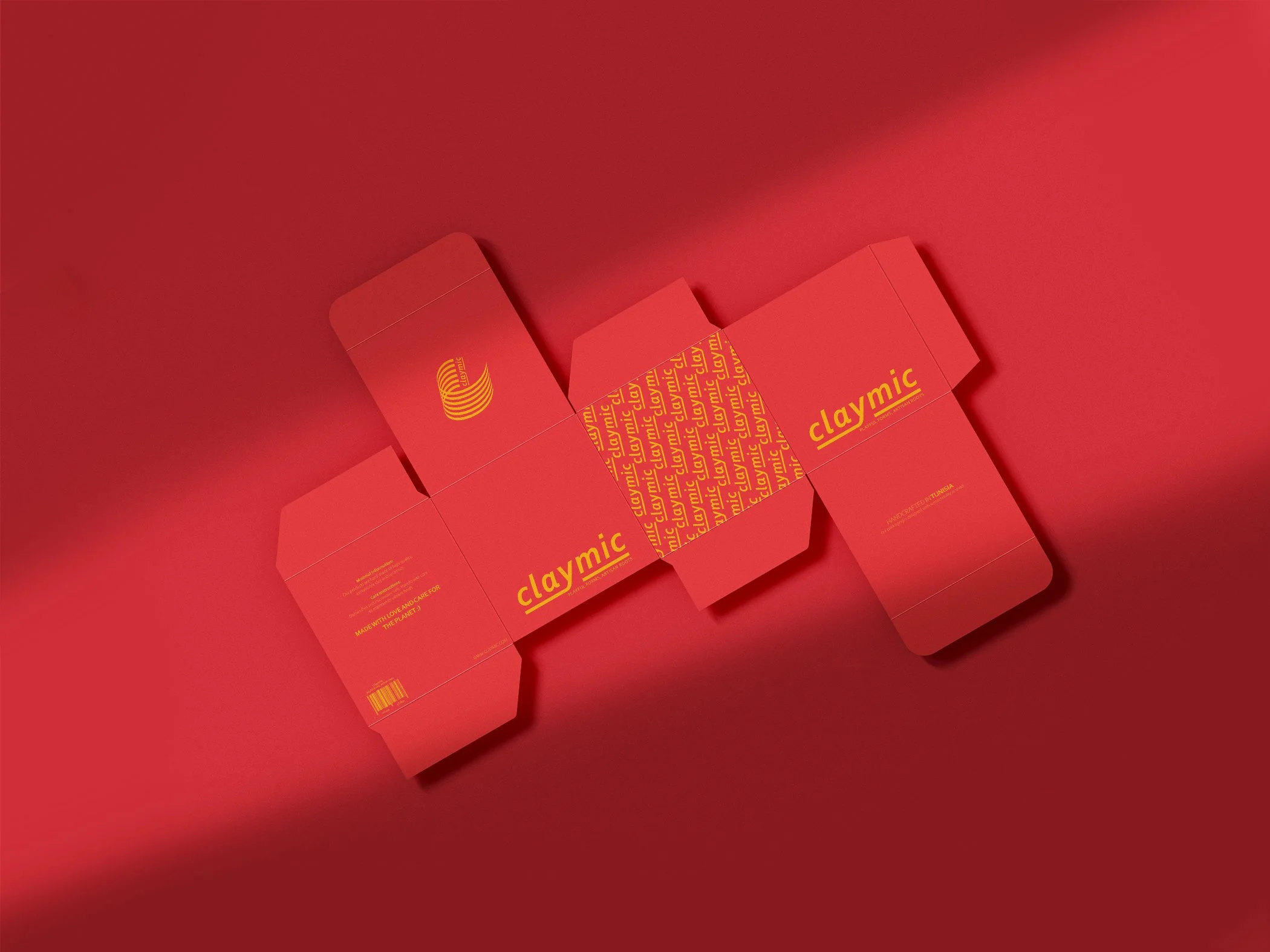
Claymic: Brand identity for a contemporary ceramics studio.
Claymic is all about playful ceramics bursting with personality. This brand identity project captures the vibrant energy and tactile charm of handcrafted pieces, blending bold colors with organic design elements. Check out how we brought Claymic’s creative spirit to life!
CLAYMIC //
CASE STUDY //
CLAYMIC // CASE STUDY //
Claymic Brand Identity:
A Playful Take on Contemporary Ceramics
The section below presents the idea behind this case study, exploring the visual identity created for Claymic and showcasing how the branding captures the brand's energy, playfulness, and artistry behind the brand.
Claymic is a contemporary ceramics brand that reimagines everyday objects with vibrant, playful energy. The goal was to create a brand identity that encapsulates the joyful and tactile essence of the products while celebrating the artistry behind each handcrafted piece.
The core of the branding lies in the logotype, which incorporates a fluid, organic form inspired by the process of shaping clay on the potter’s wheel. This design choice reflects Claymic's commitment to craftsmanship and creativity while evoking the playful and dynamic spirit that defines the brand.
A distinctive feature of the logo is the subtle incorporation of a swirl within the letter "C," symbolizing both the rotation of the wheel and the limitless possibilities of clay as a medium. This detail ties the brand to its artisan roots while adding an element of whimsy and energy to the design.
A bold and vibrant color palette was selected, mimicking the lively personality of the ceramics themselves. These warm colors not only reflect the uniqueness of each piece but also evoke the joy of holding, using, and admiring Claymic creations in everyday life.
The result is a brand design that balances artisanal authenticity with modern playfulness, ensuring Claymic stands out as a joyful expression of craftsmanship and creativity.
Furthermore, a series of posters was created as marketing assets to support the brand’s promotion across two to three phases. Each phase featured a slightly different art direction while maintaining a distinct and cohesive connection to the brand’s voice, tone, and feel.
Playful Ceramics


